We have featured posts on the Top NHL Logos of All-Time as well as on the Top 50 NHL Jerseys of all-time, so now we thought it would great to expand outside of the NHL and rate the coolest logos of all-time. Of course we cannot include logos from every professional league out there, so we reviewed logos from the KHL, SHL, NHL, AHL, CHL, and ECHL. Know of a logo that should be included in a future list? Send us a note and we will add it to our considerations for future lists.
Top 40 Coolest Hockey Logos
#40. Entering the top 40 is our first entry from the KHL. The Avtomobilist Yekaterinburg with their winged “A” logo.
#39. Our first ECHL entry comes from the Evansville IceMen. The name “IceMen” is cool enough, although what would happen if a female played on the team? The logo depicts a cartoon super-hero-like character wielding a hockey stick with what appears to be a flying puck in the background.
#38. Our first NHL entry comes in from a predecessor to the New Jersey Devils, the Colorado Rockies.
#37. Our first American Hockey League (AHL) logo comes to us from where else? Cleveland. The Cleveland Monsters logo depicts a monster emerging from the water… or is it ice? A unique font helps make this logo stand out even more.
#36. Our first entry from the Canadian Hockey League comes to us from the OHL’s Sarnia Sting. A ticked off bee (hornet) with a hockey stick in the great color combination of black and yellow.
#35. From the Liiga league in Finland comes the Mikkelin Jukurit. A powerful Thor-looking Viking head with the team colors of blue, yellow, red and white.
#34. The NHL’s second entry on our list features one of the “newer” team in the league with the Nashville Predators. A sabretooth tiger? Nicely done music city, nicely done.
#33. Back to the CHL for our next favorite. The QMJHL’s Shawinigan Cataractes and their powerful native chief.
#32. The ECHL probably has the best logos per capita of any league. Coming in an number thirty-two is Newfoundland Growlers, simple but effective with great shadow effect.
#31. The Western Hockey League enters our list with their first entry with the Everett Silvertips. The green accent color looks really sharp with the silvertip grizzly bear clenching an old wooden hockey stick.

#30. Staying with Canadian Hockey League, our next entry comes from the classic Soo Greyhounds of the Ontario Hockey League (OHL).
#29. Our next NHL entry comes from the igloo with the Pittsburgh Penguins. Another one of the black, yellow and white color combos.
#28. Coming in at number twenty-eight is our second entry from the KHL and the first nordic country to join the Russian league, Jokerit currently managed by ex-Edmonton Oilers great Jari Kurri.
#27. Another ECHL team and another bear motif. With the accent colors of glacier blue, green and black, we bring you the Alaska Aces.
#26. The Flaming “C” is up next as the NHL’s Calgary Flames and their simple yet relevant flaming “C” logo enters our list. The classic red and orange color combo looks pretty good in our books. While I’ve never been a Flames fan as my team has always been the Oilers to the North, I remember drawing this logo as a kid and being one of the first NHL logos that I could perfect.
#25. Another classic logo from the NHL. The classic Winnipeg Jets logo from their WHA and first run NHL days.

#24. Hailing from the WHL comes the very cool looking Red Deer Rebels logo. It’s mean looking, its representative of the region and with the crossed hockey sticks with pucks it easily represents the great game of hockey.
#23. The OHL’s Windsor Spitfires have had some great logos over the years. From their maple leaf based original logo in the mid-seventies to their Spitfire exhaust logo that they wore from 1987 through to 2008, great logos to back up a great team name.
#22. The Vancouver Canucks have done some interesting things with their uniforms over the years. Personally we like the black, orange and yellow color combo the best. That’s why we have selected the Vancouver Canucks skate logo of the eighties as one of the best in the biz.

#21. Another entry from the ECHL comes in at number twenty-one with the Las Vegas Wranglers. The Wranglers played in the ECHL from 2003-2014. Too bad as their logo is timeless.

#20. There are tons of hockey team logos that feature a knight or mid-evil references. While we do think the Vegas Golden Knights have a cool logo, its the classic London Knights logo of the OHL team that we fancy.
#19. Quite often you hear many people say that the NHL needs more green with regards to team colors and logos. We tend to agree. A lot of major junior teams incorporate green into their colors and one of our favorites was logo of the Prince Albert Raiders from 1996-2013.

#18. Our lone Swiss entry comes from the city that hosts the Spengler Cup. The HC Davos logo is simple but effective as a branding element.

#17. From the German league comes a now defunct team logo from the Hannover Scorpions. The Scorpions played from 1997 through to 2013 and sported this beauty of a logo… ok maybe the goalie mask on the scorpion is a little cheesy, but it’s definitely unique.

#16. Our first original six entry comes from the great sports city of Boston, home to the Bruins since 1924. Another example of that great black and gold color combination.

#15. Keeping with our green theme, one of the coolest logos was from the Hartford Whalers. Great color combination and a whale of tail.
#14. The only team with two logos on our list. The current logo of the Winnipeg Jets is a modern take on their original theme. Sleek and powerful, this logo is one of the best in the NHL. The Jets re-emerged in 2011 after relocating from Atlanta.
#13. A number of US based teams support the red, white and blue, but few do it better than the WHL’s Tri City Americans. A super cool logo plain and simple.
#12. From the QMJHL comes one of our favorite team names and logos with the Sherbrooke Phoenix. The name Phoenix is cool enough but their logo is just plain sick.
#11. Ok so there might be a little bias here, but one of our favorite logos is the Oil drop of the Edmonton Oilers. It’s a classic from the NHL. Whether it is on a white, blue or orange jersey, the logo pops nicely.
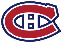
#10. Of course a storied NHL franchise has a classic jersey an recognizable logo. We would be remiss if we did not include the Montreal Canadiens logo as one of the coolest in all of hockey. Simple and classic. ‘Nuff said.
#9. The WHL has some great logos and some storied franchises. One of which belongs to the Brandon Wheat Kings. Sharp logo indeed.
#8. A 1970 expansion franchise, the classic Buffalo Sabres logo is another one that just pops off of the front of the jersey.
#7. The 1967 expansion of the National Hockey League say the league double in size from six to twelve teams. Of those teams three have gone on to win the Stanley Cup with the St. Louis Blues finally capturing the cup in 2019. The bluenote logo is a classic.
#6. When a team joins a hockey league with teal as their most prominent color, you know that they are going to need a strong logo to back up the color choice. The San Jose Sharks definitely accomplished this when they were founded in 1991. An angry shark biting a hockey stick in half? #Epic

#5. Hailing from the American Hockey League (AHL) comes the 2004 Calder Cup champion Milwaukee Admirals. Their skeleton pirate and color combination is pretty sweet. The Admiral logo is one of the best out there.
#4. Another original six entry. This one courtesy of the Detroit Red Wings and their spoked wheel. Truly classic logo.
#3. The original six teams keep rolling throughout our top ten coolest logos. Coming in at number three is the current throwback logo of the Toronto Maple Leafs. As a kid in Canada in the forties through sixties you either had a Habs sweater or a Leafs one.
#2. The iconic logo of the Chicago Blackhawks comes in at number two on our list. As the story goes, “Major Frederic McLaughlin, founder of the franchise, named his team the “Blackhawks” after the US Army unit he served in during World War One, the 86th Infantry Division, also known as the Black Hawk Division. The unit was named after Black Hawk, the Sauk leader of the eponymous Black Hawk War of 1832.” Easily one of the most recognizable logos in all of sport. As a kid I reminder Chicago goaltender Murray Bannerman with his goalie mask featuring the logo thinking how cool it looked.
#1. The coolest hockey logo we might ever see comes to use from The Western Hockey League’s Seattle Thunderbirds. Native American/Canadian motif inspired this excellent logo paying heritage to the great indigenous tribes in the region. The thunderbird logo with Seattle bordered by two hockey sticks covers off all angles of what a great logo should consist of.
There you have it, a look at the coolest hockey logos out there. There area ton on honorable mentions including NHL teams like the Seattle Kraken, Vegas Golden Knights and New Jersey Devils. Or from the CHL, the Calgary Hitmen, Kamloops Blazers, Spokane Chiefs, Winnipeg Ice, Erie Otters, and Rouyn-Noranda Huskies. Or from the many European league with their diverse and unique logo. We’ve mentioned how the ECHL has some of the best jersey and logos out there and that speaks to the cool factor of the Orlando Solar Bears, Toledo Walleye, Atlanta Gladiators, Greenville Swamp Rabbits and Adirondack Thunder.
Special thanks to the following resources:
Wikipedia