One thing hockey fans always have something to say about is a team’s uniform or hockey jersey. Especially when it comes to NHL hockey jerseys. There have been some stellar jerseys throughout the years and more recently NHL teams’ marketing departments have done a great job with establishing third jerseys or alternate jerseys that teams wear on the ice.
Definition of Hockey Jersey – a garment/shirt worn by a hockey player or competitor in the game of hockey. A hockey jersey typically includes the team primary logo with striping of the teams colors on the waist and elbow or forearm area. Secondary team logos are often featured on the shoulders.
Hockey jerseys are also referred to as hockey sweaters or hockey uniforms.
Top 50 NHL Hockey Jerseys of All-Time
The criteria for this list was simple. We polled hockey fans for the past few weeks and final say was had by the author of The Hockey Fanatic. This list of NHL jersey is meant for hockey fans to re-live some of the most memorable NHL hockey jerseys of all-time. Don’t agree with our selections? Add us on Twitter @hockeyfanatics https://twitter.com/hockeyfanatics and share your opinion of the top NHL hockey jerseys of all-time. We will factor in your feedback into an updated list for next year’s post.
With that here is a look at which jerseys The Hockey Fanatic lists as the top 50 NHL hockey jerseys of all-time. You know we almost had a four-way tie for first place? Especially between the top two jerseys.
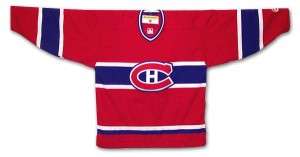
- Montreal Canadiens – rouge, blanc et blue. The traditional red Canadiens jersey that has been used as the Habs’ away jersey and now serves as their home jersey featuring the “C” and “H” logo with the simple design and blue and white piping on the arms and waist. This is probably hockey’s most famous hockey sweater. In fact this jersey is so popular that it spawned the short story, The Hockey Sweater (Le chandail de hockey in the original French) by Canadian author Roch Carrier. The story describes the author’s experience as a child growing up in his home town of Sainte-Justine, Quebec, in 1946. The story discusses the obsession he and his hockey friends had with the Montreal Canadiens and their star player, Maurice “The Rocket” Richard. With his old sweater having worn out, Carrier’s mother sought to replace it. As a French-only speaker, she wrote a letter to Eaton’s, trying to order him a new sweater from their English-only Catalogue. When the package containing the sweater arrived, the young boy was horrified to discover that he had been sent a sweater of the rival Toronto Maple Leafs by mistake. To add to the hockey lore a similar I had a similar experience as a child when my own mother ordered me an Edmonton Oilers jersey from the Sears catalogue one year for Christmas. The Oilers, who were just starting their dynasty years, were in high demand and Sears had sold out of the Oilers jersey only to replace mine with a Quebec Nordiques jersey. Living in northern Alberta I was the only kid with a Nordiques jersey in my neighbourhood. I had to wait months until I received my Oilers jersey. This just illustrates the importance and demand that fans have for their teams’ hockey sweater. The Montreal Canadiens take top honors with their red jersey.
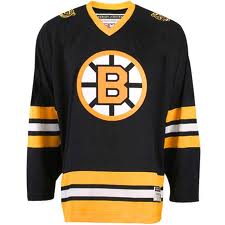
- Boston Bruins – black away jersey – the big bad Bruins always seemed menacing when they wore their dark, black away jerseys. Growing up in the eighties, and dating back to the seventies, the Bruins always seemed to dress very tough but talented hockey teams. With Espositio, Orr, Park, Cheevers and later Bourque, Neely and Middleton, the Bruins were often the team to beat in the old Adams division. Their traditional away jersey comes in as our number two pick in our list of the top 50 NHL jerseys of all-time.
- Toronto Maple Leafs – blue jersey. Ah the Leafs. The Chicago Cubs of the NHL (well not quite, but you kind of get the feeling that they have been cursed in the past 40 years). Another original six team with a simple yet classic hockey sweater. The dark traditional away jersey features the classic maple leaf logo with the simple white piping. There have been a few variations over the years but this one is our favorite. There have been some great Leafs players over the years, Keon, Sittler, Vaive, Clark and Sundin just to name a few. Whether you love them or hate them, you have to admit that the Leafs jersey is pretty cool.

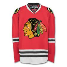
- Chicago Blackhawks – traditional red away jersey. One of the greatest jerseys in any sport, the native chief logo is a classic. As one of the original six teams the Blackhawks jersey is cherished by fans both north and south of the border.
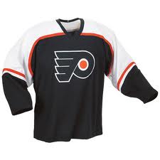
- Philadelphia Flyers – black jersey. Our first non-original six jersey makes the list. While part of the original NHL expansion in 1967, the Flyers have had some pretty cool jerseys over the years that haven’t really changed that much from the original. I am not sure if this started as the Flyers alternate third jersey but there is something about adding black to a jersey that makes it look more menacing. Maybe it is a result of the old silver and black of the Oakland Raiders of the NFL. Regardless this is a pretty sharp and mean looking jersey of the Philadelphia Flyers which hints of their past as the Broadstreet Bullies.
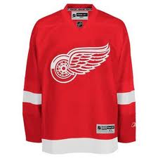
- Detroit Red Wings – classic red and white jersey. Wow the original six are dominating the list thus far as the fifth entry goes to the classic sweater of the team from Motown. We love the classic Canadian-like red with the spoked wing logo. Just think of all of the greats who have worn this hockey jersey: Gordie Howe, Terrible Ted Lindsay, Stevie Yzerman and yes Greg Stefan.
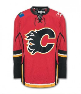
- Calgary Flames – red jersey with the black flaming “C”. Now lets get one thing straight. I am an Edmonton Oilers fan, so it pains me to see that a Flames jersey is ranking higher than my beloved Oilers’ jersey. However the Flames do have a cool logo and like we said adding black to a jersey really makes it look sharp. One thing we also like about the current Flames jersey is the fact that they place an Alberta flag on the shoulder as a secondary logo patch. Well done Flames marketing team.
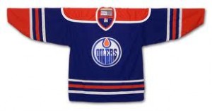
- Edmonton Oilers – classic orange, blue and white jersey. Well it was close. The jersey that started it all for me as a hockey fan. The jersey that so many fans of the Oilers dynasty years wore in the eighties. This is pretty much the original jersey of the Oilers although the orange on the original was a few shades little. The classic logo with the oil drop. My current inventory of hockey jerseys includes this version with a #93 and Nugent-Hopkins on the back. The orange, white and blue actually go well together but we always that that replacing the blue with black may be an option to look at for a new third jersey. Regardless the people have spoken and the classic dark Oilers jersey that they used for so many years as their away jersey comes in a#8.
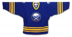
- Buffalo Sabres – original dark away jersey. Another expansion team that entered the league in 1970, the original Sabres jersey has a very cool logo and the bright blue trimmed with yellow and white looks great. The white home jersey from the same era is pretty sharp as well, look for that one to make our list a little later perhaps. Over the years, especially in the late nineties the Sabres experimented with a few variations of their jerseys but this one is their best.
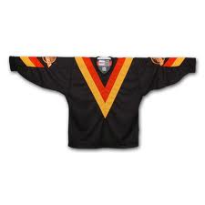
- Vancouver Canucks – flying “V” jersey of the black variety. Oh we know that we are going to catch some heat for this one. From the late seventies into the early eighties the Canucks sported what many refer to as the worst NHL jersey of all-time. We beg to differ and not just because a few of us had one of these jerseys as a kid. We love the color scheme and the “V” was more of a traditional look other than having the newly established Canucks skate logo. When you think back to the Canucks first ever run to the Stanley Cup finals in 1982, you think of two things: coach Roger Neilson waving the white towel and King Richard Brodeur donning this jersey. While the Canucks have had some of the most diverse jerseys over the years, we do appreciate this one the most.
- New York Rangers – classic white Rangers jersey. Rounding out the original six teams is the classic home jersey of the New York Rangers. This is a simple jersey with the word “Rangers” appearing in a diagonal across the chest of the sweater. Simple but effective.

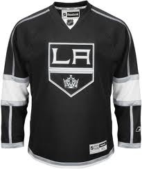
- Los Angeles Kings – current black home jersey. The defending Stanley Cup champions enter our list in the number twelve spot. The Kings have had a number of jersey over the years since they entered the league in 1967 and some have been pretty well ugly to say the least. The original yellow jersey the purple ones from the early 80’s. But then again they have done well with the black and silver as seen here with their current home jersey.
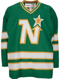
- Minnesota North Stars – green away jersey. A cool logo and good use of the color green a color not seen on too many NHL hockey jerseys these days.
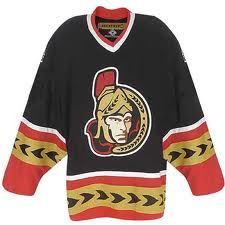
- Ottawa Senators – centurion logo with roman piping. The Sens have a tough looking logo and great color scheme. What more can we say? This jersey was an alternate jersey worn by the Senators and features some cool piping on the forearms and waist for a traditional yet modern look.
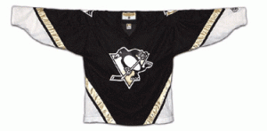
- Pittsburgh Penguins – current black home jersey. The Pens have had some pretty crazy sweater transformations over the years, but we hockey fans enjoy the current version of the jersey as worn by Sidney Crosby and gang. A great logo and nicname for an NHL hockey franchise.
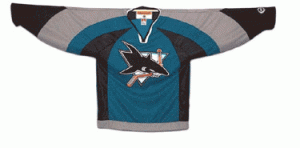
- San Jose Sharks – teal jersey with classic Sharks logo. The Sharks happen to be one of my favorite US based teams. Love the logo and the color scheme. My personal favorite Sharks jersey is their black jersey that they have supported in recent years, but this teal one from a few years back is pretty sharp as well.
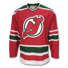
- New Jersey Devils – classic red away jersey. Previous to the current color scheme of the Devils which includes black, the color combo included a dark forest green which actually worked well with both the home and away jerseys. You cannot beat this logo for a sports franchise. The Devils red away jersey makes our list in the number seventeen spot.
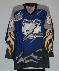
- Tampa Bay Lightning – lightning bolt third jersey. With a nickname of Lightning you have to think that the logo and uniform design would be pretty cool. Well frankly there is room for improvement, but with a third jersey such as this with lightning bolts for piping, the team was taking a step in the right direction.
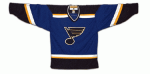
- St. Louis Blues – classic logo with dark home jersey currently worn. This jersey makes great use of the classic blue note logo. The Blues have always had a great logo and have experimented with some of the looks of their jersey. We appreciate their original home and away jerseys but these current ones just look more modern and flashy.
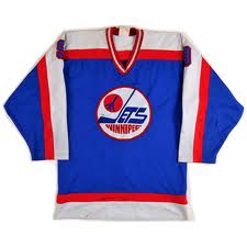
- Winnipeg Jets – classic blue away jersey with original logo. Don’t get us wrong, we like the Jets new logo and jersey, but their original away jersey from the 80’s is a classic hockey jersey with its three color combo, straight line piping and logo front in center, this Jets jersey is a classic!
- Washington Capitals – original white home jersey. This is only our second white jersey of the bunch thus far.

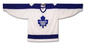
- Toronto Maple Leafs – classic white home jersey from the 80’s. This one says it all. Great logo and simple two color pattern.
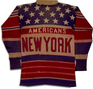
- New York Americans – traditional sweater. This was a jersey that looked like a sweater. Very classy with the use of the stars and stripes and red, white and blue color combination. This one is a true classic that we feel could have even made out top ten.
- Edmonton Oilers – white jersey. Reminiscent of their original white home jersey, the Oilers’ current white jersey is clean and sharp, just as a hockey sweater should be.
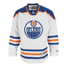
- Hartford Whalers – original green away jersey. Ah the Whalers. We were sad to seem them move to Carolina. Cool logo and again one of the few teams that can rock green as the dominant color of the jersey.
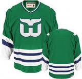
- St. Louis Blues classic white home jersey. Again great logo and just an overall sharp looking jersey. There have been slight variations over the years but this one seems to be one that many hockey fans appreciate.
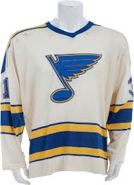
- Pittsburgh Pirates 1929-1930 final season hockey sweater – this jersey is a real beaut. The Pirates played their fifth and final season wearing these jerseys.
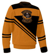
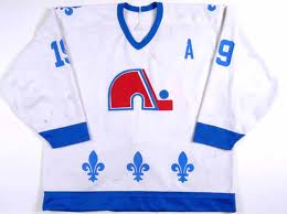
- Quebec Nordiques – white home jersey. Rumors persist that we may again see the Nordiques in the near future. Until then we can reminisce about the original Nords with a look back at this simple but dashing jersey.
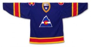
- Colorado Rockies – original away jersey. We always liked this logo which is similar to the state flag. The team however was another story.
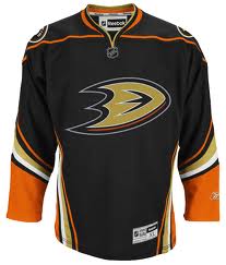
- Anaheim Ducks black home jersey – the Ducks have had some pretty crazy jerseys since entering the league in the 90’s. This is one of their better ones.
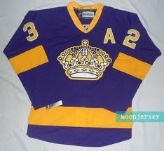
- Los Angeles Kings purple people eater jersey – we liked the crown and the purple really stood out. The Kings wore this jersey on occasion for select games during the 2011-2012 season for a retro look going back to the late 70’s and early 80’s.
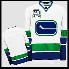
- Vancouver Canucks – original white home jersey – this jersey, featuring the original logo, has been also used as a third jersey recently buy the team.
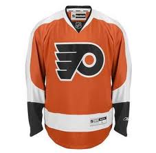
- Philadelphia Flyers orange jersey – not quite as bright as the original but with the great orange and black color combo still a sharp look from the Flyers.
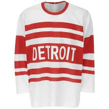
- Detroit Red Wings – original white jersey. Again more like a hockey sweater, the original Red Wings uniform features this simple but classy white with red trim and Red Wings wording across the front.
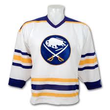
- Buffalo Sabres original white home jersey – the great Sabres logo on the white jersey looks really bright and clean. One of our all-time favs.
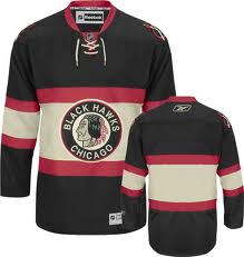
- Chicago Blackhawks – retro jersey. this jersey features the original Blackhawks logo and great sweater-like striping.
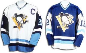
- Pittsburgh Penguins original jerseys – same logo just different color scheme.
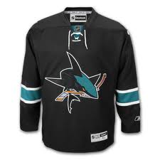
- San Jose Sharks black third jersey – all black with the killer Sharks logo. This is a great jersey where the teal arm bands really stand out. Great menacing look. We would have rated this in our top ten as it really is one of our favorites. Like we said, something about adding black to a jersey really adds to the appeal of the jersey.
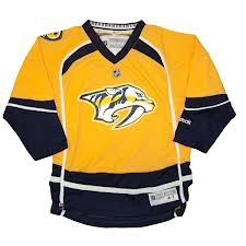
- Nashville Predators yellow guitar pickin’ jersey. The Preds have one of the greatest logos in all of sports and donned this jersey in 2011-2012. Who would of thought that a yellow jersey could look cool on a hockey team? We really like the secondary guitar pick logos on the shoulder. Music City’s team is dressed in style.
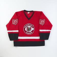
- Cleveland Barons original away jersey – cool logo and nice shade of red for the jersey color.
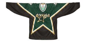
- Dallas Stars black “star” jersey – we really liked the design of this jersey featuring the unique star piping on the front and sides of the jersey. Black with some gold and green trim. Very nice.
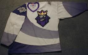
- Los Angeles Kings – king of hearts third jersey. A lot of people hate this jersey. We think that it is pretty unique and like the playing card look resembling a king of spades playing card. With a hint of purple and grey and the main late 80’s Kings logo on the shoulders. One of the most unique hockey jerseys to have ever graced NHL ice.
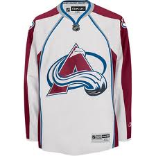
- Colorado Avalanche – current white jersey – a bit of a different color combo.
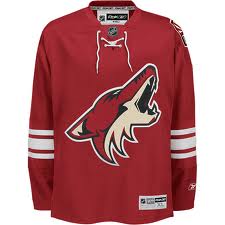
- Phoenix Coyotes – desert red, desert dog jersey. Howlin’ at the moon with this latest version of the Coyotes home jersey.
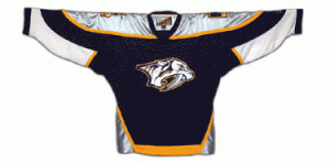
- Nashville Predators original dark jersey – again great logo and cool color combo.
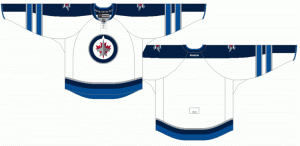
- Winnipeg Jets version 2.0 white jersey. We were really hoping that the Jets would use their original logo, but when they unveiled their new jerseys we were blown away. Many other hockey fans were as well as Winnipeg Jets merchandise was the top selling of the entire NHL in 2011-2012. Great jersey!
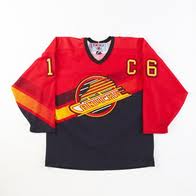
- Vancouver Canucks salmon jersey – the Canucks’ third entry to out top 50 list of the greatest NHL jerseys of all time features their third jersey they donned in the late 90’s. We like the color combination and the angle of the striping. A nice refreshing look featuring the Canucks’ skate logo. This one is a beauty.
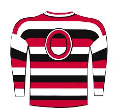
- Ottawa Senators 1933 jersey – the jerseys of the 20’s and 30’s were more like hockey sweaters. For the most part they are all very sharp looking such as this one from the original Ottawa Senators.
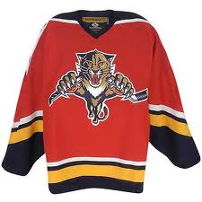
- Florida Panthers – home jersey. We love the logo and the moniker Panthers so this jersey had to be included on our list of the top NHL jerseys of all-time.
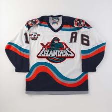
- New York Islanders white Captain Highliner jersey. – most hockey people totally dislike this Islanders jersey. Well some hockey fans actually think that it is pretty cool. The logo and font on the front is a little cartoonish but that is what makes this jersey so fun. As a result, this version of New York Islanders jersey is good enough for #50 on our top 50 NHL hockey jerseys of all-time list.
We hope you enjoy this list, again if you disagee, let us know why and perhaps we will use your feedback in an updated version of our list. Add us on Twitter @hockeyfanatics https://twitter.com/hockeyfanatics and share your opinion of the top NHL hockey jerseys of all-time.
Images sourced from various web properties on the Web.
DISCLAIMER: All logos and uniforms featured on this website are trademarks of their respective clubs. No challenge to ownership is implied. This website is not endorsed by or affiliated with the National Hockey League or any of its member clubs past or present.

3 thoughts on “Top 50 NHL Jerseys of All-Time”
Comments are closed.