As sports fans, we all have our favorite teams and our favorite jerseys. In addition hockey fans have their favorite logos. The Hockey Fanatic is pleased to being you a series of posts dedicated to our favorite logos from the top hockey leagues in North America. In our first piece we list off our favorite logos from the Canadian Hockey League. There are 60 teams currently playing in the Canadian Hockey League, so this was no easy choice. In fact we considered making this list a top 20 list, but for now here are the top 10 CHL logos.
Top Canadian Hockey League (CHL) Logos
#10. Belleville Bulls – OHL – this is just a great logo for a great nic-name. This roided out Bull signifies that the Belleville Bulls will not be pushed around by anyone. Cool logo all around. 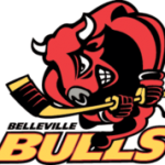
#9. Gatineau Olympiques – QMJHL – a very unique logo with a nice silver and blacked theme. A torch, and some Olympic rings. what more could you want. Stellar logo from Gatineau. 
#8. Plymouth Whalers – OHL – this logo is just fun. A mean looking whale and a hockey stick? ‘Nuff said. 
#7. Everett Silvetips – WHL – our first entry from the Western Hockey League. Probably the coolest hockey nickname out there, one of four Washington state based teams does it right with their silvertip grizzly bear logo. 
#6. Shawinigan Cateractes – QMJHL – this is one mean looking logo with an Native American Indian Chief looking like he means business. 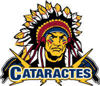
#5. Red Deer Rebels – WHL – this logo is all about the wild west, and looks like a cool tattoo in addition to be a decent logo crest logo for the Red Deer Rebels. It has elements of hockey with the two crossed hockey sticks and the skull of a cow or perhaps bull. Just a very solid design for a hockey team logo. 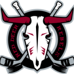
#4. Windsor Spitfires – OHL – another cool logo based on another cool hockey nickname. The Spitfire plane was the most widely produced and strategically important British single-seat fighter plane of World War II. Like the plane, the OHL’s Windsor Spitfires have been pretty successful on the ice as well. 
#3. Brandon Wheat Kings – WHL – yet another great hockey nickname with a great color combination. The Wheat Kings logo represents the prairies like no other. 
#2. Seattle Thunderbirds – WHL – if Seattle ever gets an NHL team we hope they retain the Thunderbirds moniker and the logo. A very exquisite logo representative of the northwest. Great colors and use of yet anothr native American motif. I would love to have a Seattle Thunderbirds jersey. 
#1. Sherbrooke Phoenix – QMHL – this is a pretty badass logo with the Phoenix rising out of the ashes. A great color combination with the blue and the white makes this one of the all-time greatest logos on any jersey period.
We had some honorable mentions including the London Knights, Brampton Batallion, Calgary Hitmen, Owen Sound Attack, Prince Albert Raiders, Soo Greyhounds and the Saint John Sea Dogs.
There you have it. Disagree with our selections? Drop us a line or contact us on Twitter and let us know what your favorite Canadian Hockey League team logo is.