We are one month into what has been a great start to the season for NHL clubs. A few weeks ago, the NHL and Adidas revealed this year’s version of the NHL Reverse Retro jerseys. Teams have now started wearing them in games. We wanted to wait and see the jerseys in action before sharing rankings of which retro jerseys fans thought were the best looking. We have been polling fans on social media and have come up with our rankings for the best NHL Reverse Retro jerseys for this season.
We have previously posted on the top NHL jerseys of all-time, and had a post on the top 30 current NHL jerseys for the 2014-15 NHL season. We like the idea of the retro jerseys and you would think that the older teams would have a bit more history to work with, but that’s not necessarily the case as we go through our rankings of this year’s top reverse retro NHL jerseys of the 32 NHL clubs.
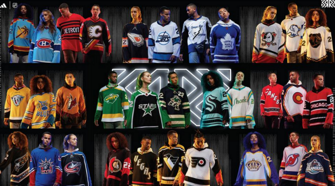
Top NHL Reverse Retro Jerseys for 2022/23
Let’s start from worst and end up with the best.
#32. Detroit Red Wings – red with black stripes and “DETROIT” in the middle? Inspired by the 1920 Detroit Cougars jersey huh? Well they should have looked elsewhere for inspiration. Yawn… boring. You cannot even find this one on the Adidas site.
#31. Chicago Blackhawks – if Detroit is at the bottom for their retro jersey effort, Chicago is not that far off. Very similar idea here. The piping is better on this one than on the Red Wings jersey.
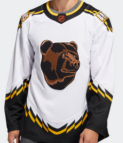
#30. Boston Bruins – sheesh two original six teams who have some of the best jerseys in the NHL rank near the bottom in terms of their reverse retro jersey efforts. Some people like the Bruin bear face but the classic “B” seems to sit better with many fans. We actually like the piping on this one though.
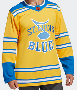
#29. St. Louis Blues – the Blues have had some terrific jerseys over the years. This one just missed the mark. This one was apparently inspired by their inaugural jersey back from 1966, which happened to be a prototype worn by the ownership of the club a year before the team hit the ice.
#28. Nashville Predators – the Preds have one of the coolest logos in sports so reverting to this version of the sabretooth tiger just doesn’t do it for us.
#27. Carolina Hurricanes – maybe we just liked the previous Hartford Whalers retro jersey the Canes used. This jersey is not bad, but hard to top the Whalers jersey.
#26. Ottawa Senators – The original version of this jersey was the team’s first third jersey used back in 1997. Like the font for the numbers and the Centurion logo but the lack of /minimalistic use of piping takes away from what otherwise would be a classic.
#25. Columbus Blue Jackets – love the stars down the arms but this one just looks too similar to their regular jersey for us.
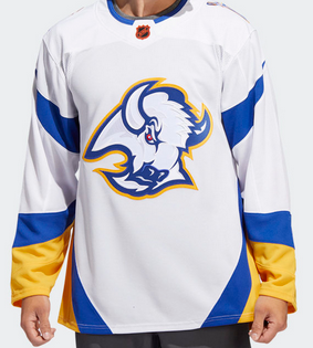
#24. Buffalo Sabres – had a debate over this one with a bunch of other hockey dads at the rink last week. Most of the guys like the Buffa-Slug logo. They used their modern day colors which are great. Nice jersey with a minimalistic feel. Nice job Sabres.
#23. New York Islanders – ah the return of the Captain Highliner logo. Being it’s the Isles’ 50th Anniversary we just expected a little more.
#22. Toronto Maple Leafs – Honoring the 1961-62 Stanley Cup-winning uniform from the Leafs, this year’s version of the Leafs’ reverse retro is nice, but typical.
#21. Philadelphia Flyers – we should rank the Flyers higher for the fact that they will be donning cooperalls for practices on reverse retro jersey nights. Flyers jerseys are always cool and their classic logo is front and center like it should be.
#20. Montreal Canadiens – Based off of the Habs 1979 jersey this one appears to pay homage to the Montreal Expos withe the choice of blue. ESPN ranked this one number three on their list. Guess those folks are big fans of the Expos.
#19. Dallas Stars – like many, we’ve always said that the NHL needs more green. The Dallas Stars do a nice job with their reverse retro utilizing green down the sleeves. The Stars looked to modernize their inaugural season uniform with its current color palette. Nice effort.
#18. Washington Capitals – the Caps went back to their 2005 uniforms with the return of the Screaming Eagle. Totally relevant logo nd a sleek new look. Black always seems to look good on a sports unform doesn’t it?
#17. Tampa Bay Lightning – we always liked the Bolts “Storm” jersey from the late nineties. With a team moniker of Lightning you just have to use lightning bolts as your piping dont’ you?

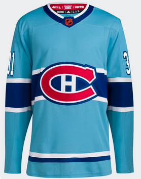
#16. Vegas Golden Knights – one of the league’s newest teams, the Knights already have cool jerseys. So would could be cooler? How about a “glow in the dark jersey”? The simple, yet effective “VEGAS” diagonal and glitzy font do look like something you would find on the Las Vegas Strip.
#15. Pittsburgh Penguins – lots of fans appear to like Robo-Penguin… it’s alright but we prefer the classic Penguin logo. Watched a bit of a Pens game yesterday when they wore their reverse retros and from behind we thought the Bruins were playing.
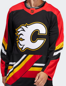
#14. Calgary Flames – same cool flaming “C” logo but while this is a retro look, it could have been so much better. Does anyone else think that they should have Flames instead of the angled piping along the waist of the jersey? Again the use of black is quite effective with this one.
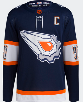
#13. Edmonton Oilers – ah inspired the Todd McFarlane mid-to late-nineties jersey as worn by Ryan Smyth and Georges Laraque. The jersey features an oil drop, surrounded by a dynamic gear, with each bolt hub representing one of the team’s five Stanley Cup championships. We like the orginal version better and as much as we like orange, it seems a little out of place on this one. The name and number font is pretty cool though.
#12. Colorado Avalanche – honoring the State flag is pretty cool. The defending Stanley Cup champions did it right with this one. They always seem to have solid jerseys don’t they? It’s a sharp looking jersey.
#11. Seattle Kraken – with their first ever reverse retro jersey, the Kraken narrowly miss making it in our top ten for NHL reverse retro jerseys? The dominate Seattle “S” crest is submerged in the navy blue striped sea, where the Kraken’s red eye peeks just above surface. Great use of the team’s color scheme.
Top Ten NHL Reverse Retro Jerseys
Here’s a look at the best of the best.
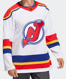
#10. New Jersey Devils – the Devils kept their great log but added their original colors going back to when the team, was the Colorado Rockies and prior to that the Kansas City Scouts. Definitely inspired by the Kansas City Scouts jerseys of the 1970’s.
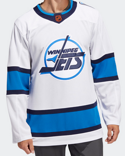
#9. Winnipeg Jets – classic logo with a simplified color scheme. Inspired by the 1990 jersey, the inaugural year of the uniform worn by Teemu Selanne when he broke the rookie goal scoring record in 1992-93.
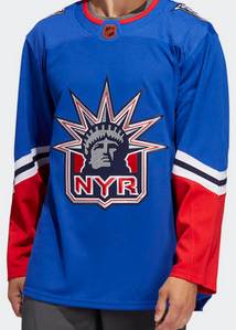
#8. New York Rangers – the Rangers brought back the old Statue of Liberty logo and went with a little shade of blue. Retro but modern at the same time.
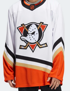
#7. Anaheim Ducks – leveraging the team’s modern-day color scheme, the Ducks go back to their first season with their reverse retro.
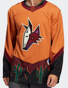
#6. Arizona Coyotes – probably one of the most unique designs for the reverse retro, the Yotes did a wonderful job as this jersey depicts a desert and incorporates the Coyotes crescent moon logo as part of the landscape, classic log intact. According to Adidas this is “the first time this trending earth tone color has been worn by any NHL team.” Well it looks fantastic. If there was one new jersey that we’d pick up it would probably be this one.
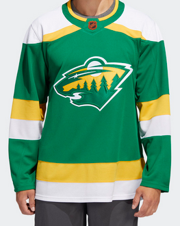
#5. Minnesota Wild – same logo bit with the colors of the original Minnesota North Stars. ‘Nuff said.
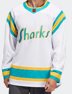
#4. San Jose Sharks – when we first saw this reverse retro from the Sharks it was automatically in our top five. Paying homage to the original California Golden Seals, the cool color scheme and Sharks logo reminds us of an old WHA-like jersey.
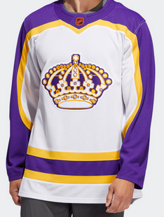
#3. Los Angeles Kings – ah the only team with purple as one of their jersey colors. What a sharp lookign jersey this is. The original crown logo is awesome (although it reminds some of us Oilers fans of the Miracle on Manchester). This jersey pops. Great job Kings, Adidas and marketing folks.
#2. Vancouver Canucks – ah Johnny Canuck. Taken from their AHL farm team, the Abbotsford Canucks, the Canucks hit a home run with their reverse retro for 2022-23. NHL.com states it best: “Inspired by the Canucks’ 1962 uniform of the former Western Hockey League, the Reverse Retro jersey features a recreation of the 1960s Johnny Canuck icon on the center crest. Matching the original jersey, player numbers appear on the left chest and right shoulder only”. The player numbers on the back are huge. This jersey is nearly perfect! Check out the Quinn Hughes version below. Nicely done Vancouver. I stand corrected… I’d love one of these jerseys as well.
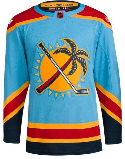
#1. Florida Panthers – along with Arizona’s reverse retro, this Panthers jersey gets top marks for creativity. What is not to like about this jersey? Great color scheme. Use of the secondary logo as the primary logo is awesome as the iconic sun, palm tree and stick logo is featured front and center. This is a classic! Most people we polled had this within their top two choices for best reverse retro jersey. We concur. Great job FLA.
Well done to these teams and their marketing partners. It will be interesting to see which jersey generates the most sales and revenue at the end of the season. You know that hockey fans will be saving their money to represent their favourite teams.
Looking to purchase an NHL Reverse Retro jersey? Visit the Adidas site to order one today. (Images courtesy of Adidas).
Additional Resource: NHL.com: Reverse Retro Reveal