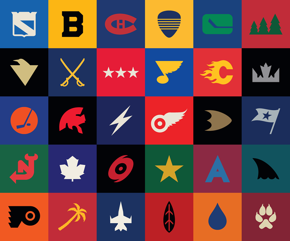
Hockey Fans have their favorite teams. Hockey fans have their favorite jerseys and hockey fans have their favorite logos. When it comes to NHL logos there have been some great ones over the years. We thought that it would be fun to rate the top NHL logos of all-time. The criteria for selection was simple, these are the favorite all-time NHL logos as chosen by the Hockey Fanatic. There have been some interesting ideas for NHL team logos over the years, such as these futuristic logos:
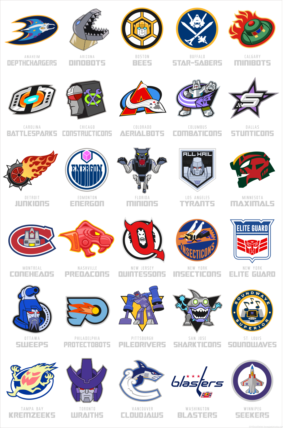
Some have even updated NHL logos based on cartoon characters such as the Simpsons or Transformers which is pretty cool too.
Of course as a hockey fan you will have your favorites, so if your favorite logo does not make the cut, let us know and we will re-evaluate for a future version of this post. In fact we have even set up a poll to see which NHL logos have he greatest appeal.
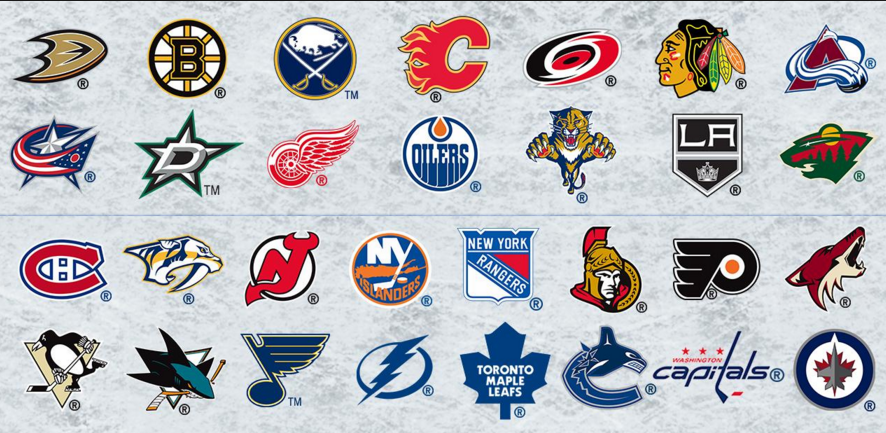
Top 40 NHL Logos of All-Time
There have been some great NHL logos over the years. However it seems like the best logos remain close to their original roots as you will see by our list of the top NHL logos of all-time.
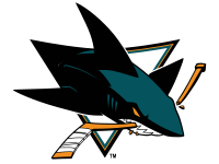
- San Jose Sharks – just a killer logo. Whats more better than a menacing shark snapping a hockey stick in half with it’s powerful jaws? The logo is perfect.
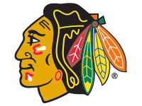
- Chicago Blackhawks – maybe some controversy around this logo and team moniker, but we still think that it is one of the best in all of sports.
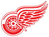
- Detroit Red Wings – the classic spoked winged wheel still looks pretty cool.
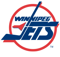
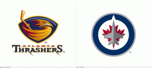
- Winnipeg Jets (current) – when the Atlanta Thrashers moved to Winnipeg in 2011, fans were excited to hear that the team would again be known as the “Jets”. The original Winnipeg Jets (now the Arizona Coyotes) had a pretty cool logo in its own right but the new logo is simply on a level of its own.

- Hartford Whalers – the old green and blue jerseys with a “W” and a whales tail. Simple yet effective. Good enough for top five on our list.

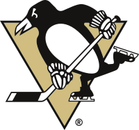
- Pittsburgh Penguins (current) – the Pens have experimented with their logo over the years, but we like the current version which is pretty much the same one as the team had in the 80’s.
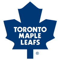
- Toronto Maple Leafs (current) – the Leafs are coming up on their 100th anniversary, they too have altered their logo over the years, but we think the classic and current Maple Leaf logo is their best.
- Buffalo Sabres (current/original) – we have always like this logo. The Sabres have experimented over the years but the original still looks fresh 40+ years later.
- Montreal Canadiens – the bleu, blanc et rouge is a classic with the “H” which stands for “Habitants” in the middle of the “C”. It is one of the most recognized and iconic sports logos in the world.
- Philadelphia Flyers – another logo that while simple in design has not changed much over the years. As the story goes give Ed Snider’s sister Phyllis credit for naming the team “Flyers” as they were set to enter the NHL for the 1967/1968 season.
- Minnesota North Stars – ask many hockey fans and this logo rates as one their favorites. Cool color scheme and an even better logo made the North Stars jersey really pop.
- Nashville Predators – a cool looking sabre-tooth Tiger is one of the better logos that we have seen from recent expansion teams.
- Boston Bruins (classic) – another classic logo from an original six NHL team.
- Calgary Flames – nothing wrong with the flaming “C”. The addition of the color black to the logo a few years ago was a nice touch.
- Edmonton Oilers – staying in the province of Alberta with the Flames neighbor to the North, the Oil Drop logo represents my favorite NHL team. This is what I grew up with watching the Dynasty teams of the 80’s. This logo looks even better on the Oilers new organic jerseys that they have unveiled this season.

- Quebec Nordiques – a lot of thos old WHA teams had great logos and team names. The Noridiques logo was pretty simple, could we be seeing it again in the NHL within a few years?
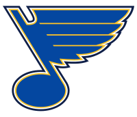
- St. Louis Blues – ahh the old bluenote. Another example of simple and effective.
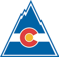
- Colorado Rockies – this was a pretty cool logo reflective of the mountainous state. The team would move to New Jersey to become the Devils to start the 1982/83 NHL season.
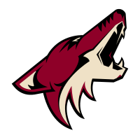
- Arizona Coyotes (current) – bark at the moon. This logo is probably the best one for the Yotes as of yet. The original logo with the Aztec motif was a little out there, but Coyote barking into the sky is pretty cool.
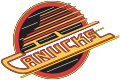
- Vancouver Canucks (skate logo) – I prefer the black and yellow color scheme that the Canucks sported throughout the 80’s and into the 90’s. The Canucks skate logo is still our favorite.
- Los Angeles Kings (Gretzky era) – when Wayne Gretzky was traded to Los Angeles from Edmonton in 1988, the Kings went from being also rans to formidable Cup contenders. They donned the black and silver color scheme a la the Oakland Raiders and introduced a much better logo than their classic Kings crown logo.
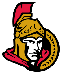
- Ottawa Senators (current) – the Sens current logo projects an image of a gladiator-like face ready to do battle and win at all costs. Good color scheme and cool logo.
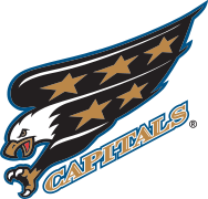
- Washington Capital eagle logo – from 1995 to 2000, the Caps sported a cool looking eagle logo and while we liked the original/current logo, this one was a refreshing update.
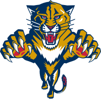
- Florida Panthers – maybe we have a thing for cats? Regardless, the pouncing panther is a cool looking logo.
- New Jersey Devils (current) – we always thought that this logo was quite well done. The “N” with devil horns and the “J” with a forked tail. We get what they were going for.

- New York Rangers (classic logo) – the Rangers haven’t changed their logo much over the years, although they did have that cool Statue of Liberty logo (which you might see a little later down on our list).
- Dallas Stars (current) – love the color scheme and the new logo. If anyone from the Stars organization reads this, we’d be willing to place you higher in exchange for a nice green Stars jersey.
- New York Rangers Statue of Liberty logo – the Rangers used this logo on their third jerseys from 1996-2007. The big NYR under the Statue of Liberty was a power image and decent logo.
- Tampa Bay Lightning Classic Lightning Bolt logo – there is so much that you could do with a lightning theme. We prefer Tampa Bay’s lightning bolt logo as opposed to their more recent and more simple lightning bolt.
- Kansas City Scouts – yes the NHL once had a team in Kansas City. In fact prior to the Devils being in Colorado as the Rockies, the team was the Kansas City Scouts.

- Winnipeg Jets (original logo) – what is not to like about the Jets original logo?
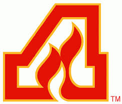
- Atlanta Flames logo – the Calgary Flames came via Atlanta so it is cool to see the the “A”‘s on the jerseys of the assistant captains pay tribute to the original Atlanta Flames logo.
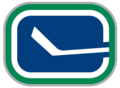
- Vancouver Canucks (original logo) – the original “C” with a hockey stick logo with the blue and white color scheme.
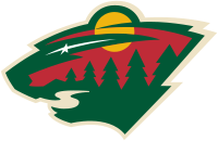
- Minnesota Wild (original logo) – I’m not sure if the animal is a timber wolf , but the original Wild logo is still our favorite.
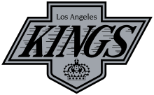
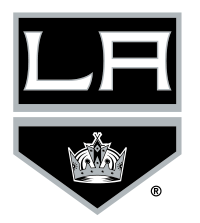
- Los Angeles Kings (current) – the Kings current logo is like a coat of arms and is a creative way to brand the team.
- Atlanta Thrashers (original logo) – a Thrasher swinging a hockey stick? It works.
- Edmonton Oilers Cog logo – comic book artist Todd McFarlane designed this logo for the Oilers third jersey. Perhaps it was a little ahead of its time?

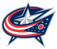
- Columbus Blue Jackets (current logo) – the stars and stripes logo of the Blue Jackets is quite appealing.
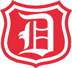
- Detroit Red Wings Original”Big D” logo – when the Red Wings entered the NHL in 1926/27 their jerseys consisted of a simple Capital “D”.
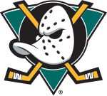
- Anaheim Might Ducks (original logo) – the Mighty Ducks movie was perhaps the inspiration for the original logo for the Ducks which featured a Donald Duck-like character in a golaie mask. A lot of people do not like the logo, but it is good enough for the final entry on our list.

There you have it a look at the top 0 NHL logos of all-time.